


Over the past few years, interface design and development have changed, and product development speed has increased dramatically. Products have acquired more functionality, and teams have grown in size. The more complex the products and larger the teams, the more difficult communication between team members becomes. Sometimes, reaching agreement on basic issues, such as what button sizes in the interface will be or what color they will be, takes a lot of time.
To simplify this communication, designers and developers started creating standards and rules, avoiding the need to discuss the same things repeatedly in order to dedicate time to more valuable tasks, so design systems became this time-saving agreement between interface designers and frontend developers.
In this article, we'll examine what design systems are and how they work
What is a design system?
In the design community, you can often hear abstract definitions for design systems like "design language", "design DNA", "design philosophy" and so on. Of all these general definitions, "single source of truth" fits best, but it still sounds too abstract. We can also use a definition by NN/Group: "A design system is a set of standards to manage design at scale by reducing redundancy while creating a shared language and visual consistency across different pages and channels.", but I set myself a goal to find a more down-to-earth definition that would be clear even to beginners.
The best definition I came up with:
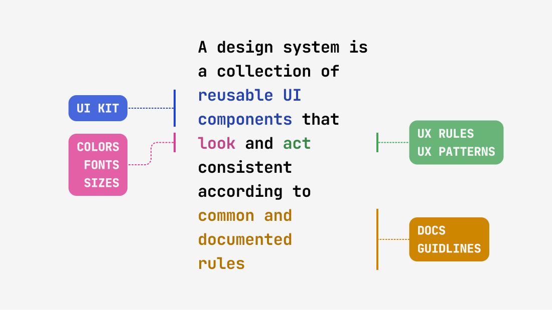
“A design system is a collection of reusable UI components that look and act consistent according to common and documented rules”
In other words, a design system should answer 4 main questions:
- What UI components do we use?
- How should components look?
- How do components behave?
- Where do we look to remember all this?
Let's examine each of these questions and see how a design system should answer them.
1. What UI components do we use? (UI Kit)
Every interface consists of repeating components, such as buttons, input fields and icons. In an ideal world, when creating a new layout, an UI designer simply takes a ready-made, well-thought-out button from the Figma library, and the developer uses the exact same button from a ready component library, but in code. Sounds simple, but before this, teams usually spend a lot of time agreeing on many questions, such as:
- Do we use a ready-made design system or create our own?
- How do new components enter the system?
- Where do we store documentation?
- What states will the components have?
These are fundamental organizational challenges that all teams inevitably face when beginning to create a design system. However, by laying a good foundation, you will significantly simplify future work. Each of these questions is quite extensive and deserves a separate article, so for now I'll limit myself to examples of quality design systems at the end of this article.
2. How components should look? (Colors, Fonts, Sizes)
After resolving the main questions from the first point, we're ready to customize our design system for our brand, and it doesn't matter whether you purchased a ready-made design system or are building everything from scratch — you'll need to configure it either way. At this stage, we need to align the appearance of all components so they look consistent and answer new questions.
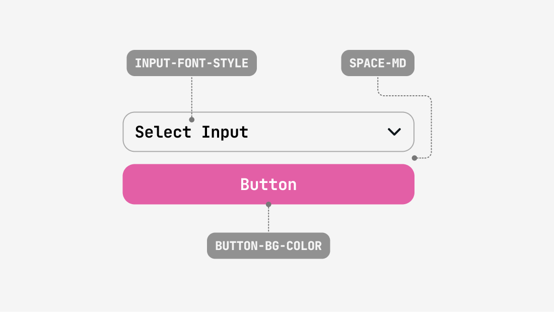
At this stage and further, let's look at what new questions might arise based on the Button component, which is definitely present in all design systems:
- What color will buttons have in the hover state?
- What horizontal padding will be inside buttons?
- What button sizes do we use?
All these questions are answered by the system of variables and styles — the second most important part of the design system. Usually, the system of styles and variables consists of 4 parts:
- Color variables
- Text styles
- Spacing variables
- Corner radius variables
Below, let's examine each part in more detail
2.1 Color variables
Color variables are a limited set of colors that we use in the design system, such as: color-bg-danger or color-text-secondary
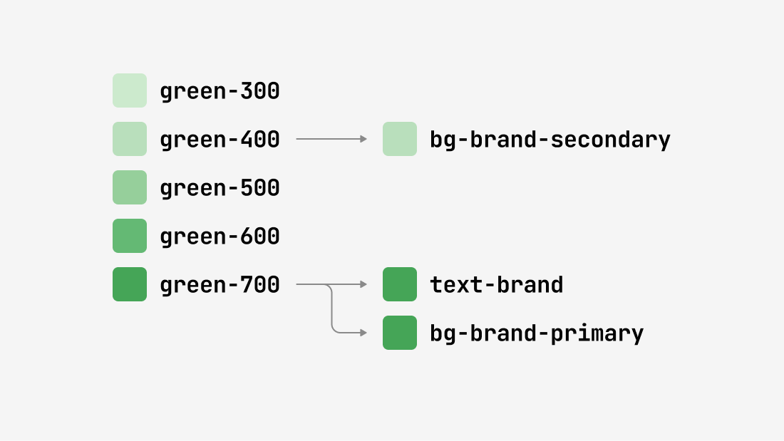
Typically, a color system consists of several levels:
- Base colors — these are the foundation of your palette, for example blue-50, blue-100, blue-200 and so on. All other colors are composed from these sets of colors. Usually, one base color is taken for each scale and broken down into shades on a scale from 9 to 16 variations. Here is a good tool to create your own color scale: https://www.radix-ui.com/colors/custom
- Semantic colors — these are variables with names that reflect their function: primary, secondary, danger. Primary — main colors, secondary — supporting colors and so on.
- Contextual colors — variables used in specific components: button-primary-background, input-border.
This structure makes the system flexible: by changing one base color, you'll update all components associated with it. As an example, I recommend looking at how colors are structured in Glow UI
2.2 Text styles
Text styles define which fonts are used for components. We cannot use different fonts or different font sizes within similar components. This would lead to components looking different even if they use the same color palette.
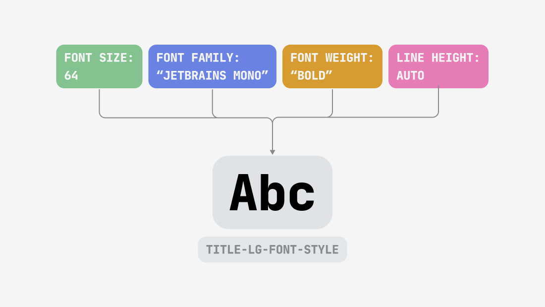
If one color in a design system consists only of a color code, for example #FF0022, then one font style consists of several parameters:
- Font Family — the name of the used font, for example: Inter, Helvetica, Arial
- Font Size — font size
- Font Weight — font weight
- Line Height — line height
- Letter Spacing — distance between letters
It's better not to change Line Height and Letter Spacing if you don't understand why
There are two ways to indicate Font Weight: with numbers (400, 500, 600) or with text (Regular, Medium, Bold). I recommend using numerical values since they are more precise and standardized across different systems, while text designations can be interpreted differently in various fonts and tools.
2.3 Spacing variables
Spacing variables define the spacing between interface elements and within them.
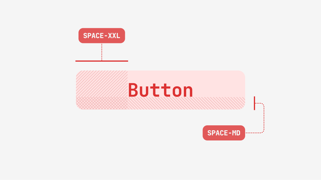
Usually, design systems use a scale with increments of 4 or 8 pixels. For example:
- space-md: 8px
- space-lg 12px
- space-xl: 16px
I recommend not sticking to a 4-pixel grid. It seems like a small distance, but in reality, this approach imposes more limitations than benefits. It's better to use a more flexible grid that's a multiple of 2 pixels.
2.4 Border radius variables
Border radius variables are responsible for rounding the corners of components. The larger the component, the larger radius is typically needed for visual balance, but this is for you to decide. Example:
- radius-sm: 4px (for small elements)
- radius-md: 8px (for medium components)
- radius-lg: 12px (for large blocks)
3. How components behave? (UX)
Appearance is only half the story. For a comprehensive design system, it's necessary to define how components react to user interaction. Returning to the button example, we need to answer the following questions:
- What animation occurs when a button is pressed?
- How does the loading state look after clicking?
- What happens if the user hovers over a disabled state?
Unlike static UI kits, a complete design system includes documentation on animations, transitions, and component interactivity. For developers, this can be presented as code, and for designers – as prototypes or video examples.
4. Where to look to remember all this? (Documentation)
Even if you have an excellent design system with well-thought-out components, styles, and behaviors, it will be useless for new team members or those who didn't participate in its creation without documentation. And to be honest, not every experienced designer or developer can keep all of this in their head.
Documentation is the key element of a design system that transforms a set of components into a "single source of truth." Among other things, documentation can also include:
- Usage rules for each component
- Examples of correct and incorrect design
- API documentation for developers
- Design principles followed by the team
- Instructions for making changes to the design system
These tools are commonly used for design system documentation:
Do you need a design system?
To answer briefly and clearly: most likely yes. Having a design system or at least a minimal UI kit has become a necessary standard in product development recently, as it significantly accelerates design processes. Additionally, the new generation of interface designers are taught to work with design systems in all educational courses, and they can no longer imagine working any other way.
Why design systems have become widespread in the industry:
- Design systems significantly save time for designers and developers, especially when using ready-made solutions.
- Figma — the most popular interface design tool — is optimized for working with design systems through components, variants, and variables.
- No alternative approaches have emerged in the industry that would be equally effective for accelerating design processes.
How a design system accelerates work:
- The designer gets everything necessary to build a mockup. If some UI components are missing, they can create them from existing elements. They don't need to think about sizes or colors — these decisions have already been made within the design system.
- If a design system exists not only in a Figma file but is also synchronized with code, communication between designers and developers improves dramatically. They no longer need to argue about component sizes or colors, as they've agreed on these in advance.
- And if the design system includes not just components but also UX patterns, such as filtering or modal window behavior rules, and all of this is connected to code, programmers can independently assemble typical layouts from these ready-made "interface pieces" without involving a designer.
Pros and cons of using design systems
Design systems are not a silver bullet, but rather the most effective approach today for structuring and accelerating work between design and frontend development teams. Now that we've understood what design systems are, let's look at their advantages and disadvantages.
Pros of using design systems
- Accelerates development and design. Designers and developers don't need to create components from scratch each time or repeatedly negotiate minor details. In my experience, developers have even assembled entire sections using ready-made components without involving designers, but this is only possible when designers have done a good job with the design system.
- Product design looks consistent. Every detail of your product follows common rules, so all its parts look like a cohesive whole. This directly affects how new users perceive your product, and if your service appears to be assembled from different mismatched pieces, it can be off-putting
- Synchronizes all team members. With a well-developed design system and documentation, even a newcomer to your team will be able to understand which components to use and according to which rules.
Cons of using design systems
- Expensive to create and maintain. Creating and maintaining a quality design system requires significant resources that only large companies can afford, while medium and small companies usually purchase ready-made design systems. I've compiled the best commercial UI kits and design systems for you in my previous article.
- Imposes limitations. With the advent of design systems in the product design world, not all designers were pleased. For many of my colleagues, design systems became a barrier to creative expression, and they like to repeat that all products have become similar to each other. Well, something has to be sacrificed for the acceleration of the industry.
- Can complicate processes. In some teams, especially large ones, any changes to the design system may require the attention of several people responsible for the product at once, and overload the approval process, which will take a lot of time. But this is usually relevant for teams that already have process issues.
Examples of good design systems
There's so much more to write about design systems, but it's always better to see with your own eyes what they look like through specific examples, and we're very fortunate that some world-renowned companies make their design systems public so we can learn from them. As an expert in design systems, I've selected examples of the best public design systems for you.
Polaris
Developer: Shopify
Website: https://polaris-react.shopify.com/
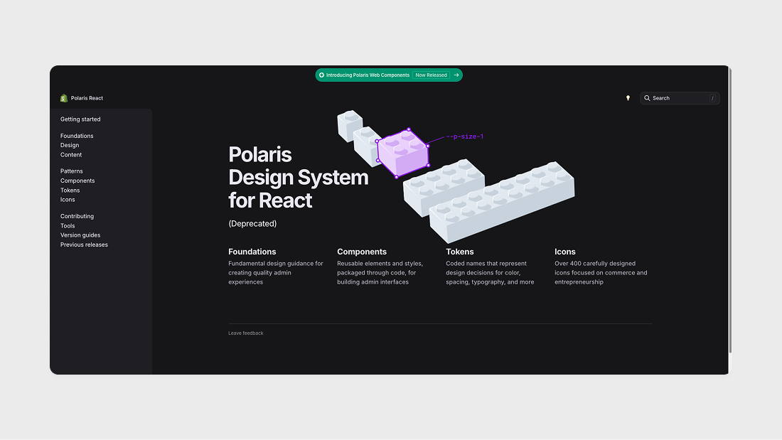
This design system from Shopify is my favorite. It's one of the most detailed and comprehensive design systems for admin interfaces. Each component and block has its variations, and their variable scheme became the main source of inspiration for the Glow UI variable system.
Atlassian Design System
Developer: Atlassian
Website: https://atlassian.design/
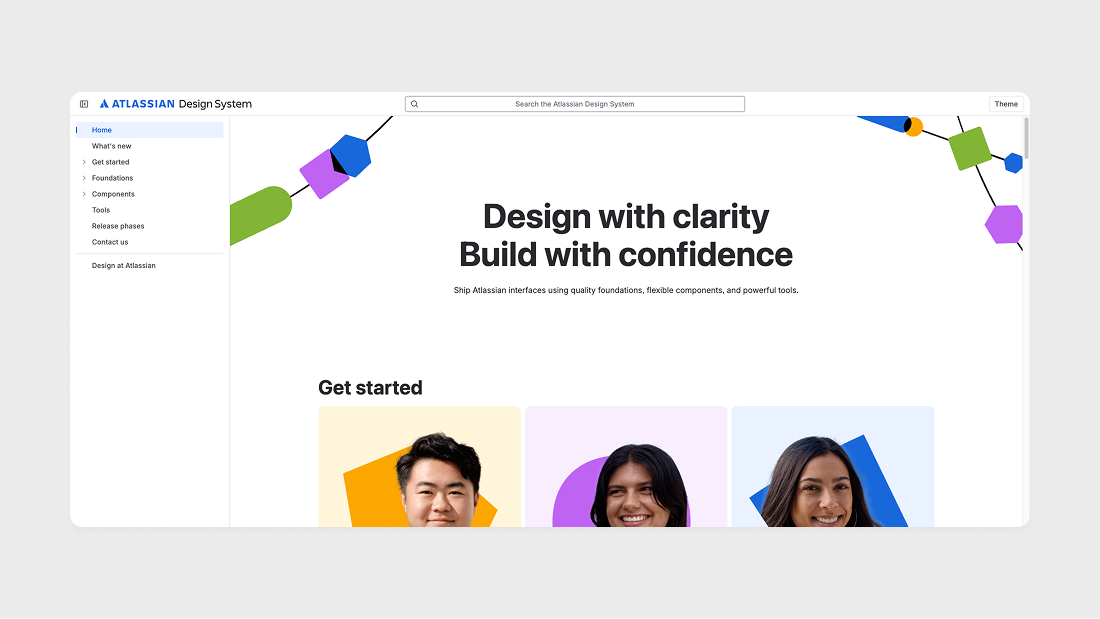
Another very detailed design system on par with Polaris from Shopify. They even have a Changelog for each component and their own plugins for Figma.
Wise Design
Developer: Wise
Website: https://www.wise.design/
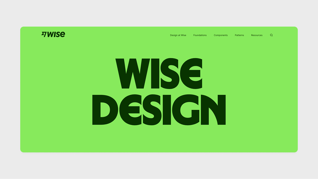
This is the most beautiful design system I've ever seen, and an excellent example of how a design system can be used to describe a brand. They even have a special Tone of Voice section dedicated to how to communicate with users through the interface — and all of this is part of the design system!
Material Design
Developer: Google
Website: https://m3.material.io/
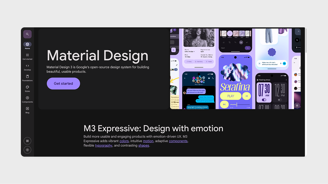
Material was first announced in 2014 at the Google I/O conference, making this design system from Google the oldest of them all. Material has grown from a simple UI kit for Android into a huge ecosystem and is used far beyond Android devices. Most importantly, the code for this design system is completely open and available on Github.
Glow UI
Developer: Glow UI
Website: https://www.glowui.com/
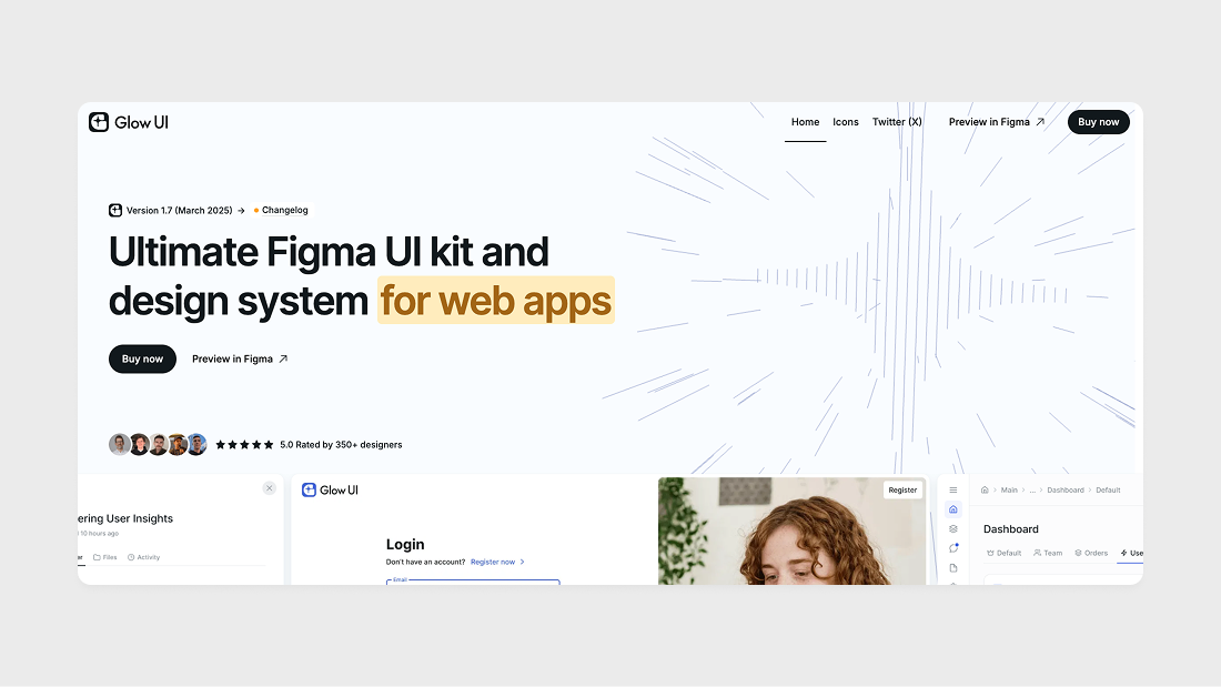
Glow UI is a fully ready-to-use design system for Figma with support for all the latest updates and its own variable system. It includes over 8000 components and variants, 4 themes, 1200 variables and styles, 440 custom icons, and much more.
Other good design systems
Apple Human Interface Guidelines by Apple
Microsoft Fluent Design System by Microsoft
Garden by Zendesk
Pajamas by GitLab
Primer by GitHub
Conclusion
In this guide, we've covered what a design system is, what components it includes, and why it's important for modern digital products. Design systems have become an integral part of the workflow for teams of any size, helping to create consistent and effective user interfaces. Whether you're creating your own system or using a ready-made solution, it's important to understand the principles and benefits it brings to your product and team. If you need a consultation or advice on design systems, write to me: alexey@glowui.com. Good luck!
