


Selection criteria for Figma UI kits in this top
To be included in this ranking, a UI kit must have at least one update in the last year, be the best in quality among other offerings, and be ready for production use as is.
The main purpose of this article is to highlight the best products, rather than create an unnecessarily huge list of 30+ products that would be easy to get confused in. We covered UI kits for all popular categories: web apps, SaaS, dashboards, landing pages, iOS, and Android.
Why do you need a UI kit for Figma?
You've probably noticed that the interface of any web application or mobile application consists of repeating elements: buttons, input fields, icons, and other components (interface designers call them just that - components). Fortunately, designers and frontend developers have learned to identify these repeating components from different projects and create collections from them (UI kits), which can be used in new projects instead of "reinventing the wheel".
"Reusing components in new projects" sounds simple, but in reality, teams spend hundreds or even thousands of hours creating and maintaining their own UI kit and design system. This happens due to constantly changing approaches in the product design industry, the emergence of new components, and updates to Figma itself - the program in which most interface designers now work.
Only large teams can afford to fully develop and maintain their own UI kit or design system from scratch. For small companies, this is a task that requires too much time and money, while for solo designers or freelancers, such a task seems very difficult.
As a solution, pre-made UI kits and design systems with components, styles, and variables ready for use in your products have appeared on the market. You simply purchase a ready-made UI kit for Figma and save thousands of dollars and hours of work.
Each Figma UI kit is unique and has its own strengths and weaknesses. There are many ready-made solutions on the market right now, however 99% of them are of low quality, don't receive updates, or contain a limited number of components. Some UI kit authors try to create a universal UI kit "for everything," which negatively affects the learning curve and makes customization of such huge UI kits difficult. We have selected the best UI kits and design systems for Figma available on the market in 2026.
1. Glow UI - best for web apps and SaaS
glowui.com - From $72 or free
“It’s costs less than one designer’s working day - but saves you months.”
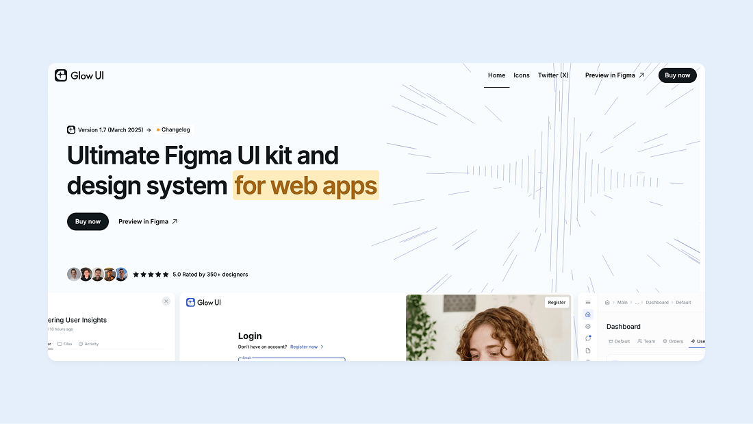
Glow UI is an advanced UI kit and design system for Figma, designed for creating web applications (SaaS, admin panels, dashboards, and other web services). Constantly updating, Glow UI maximizes all the latest Figma features. The system uses the latest Auto Layout 5.0, features a user-friendly component structure, and has the best color system on the market that no other UI kit offers. Glow UI is already used by hundreds of paid and thousands of free users. In this UI kit, you'll find everything you need to start creating modern UI.
Glow UI in numbers:
- 6500+ components and variants
- 1200+ variables and styles
- 40+ templates
Basic features:
- Figma variables support: Yes
- Free version: Yes
- Dark theme: Yes
- Responsive design: Yes
Notable features:
- Regular updates, including the latest Figma features released at Config 2023, Framework 2024, Config 2024 and Config 2025
- Multi-Theming. Support for dark theme and any other color themes, which can be created in just a few clicks
- 440+ custom icons that you can download for free
- Wireframe mode for rapid UI prototyping
As of February 2026, almost all popular UI kits and design systems stopped receiving updates back in 2025, which cannot be said about Glow UI. This product is constantly evolving, maintaining a balance between stability and innovation, taking into account user feedback and regularly releasing new updates.
2. Frames X UI Kit - best for learning
framesxdesign.com - From $68 or free
“Increase your design to production speed 10x.”
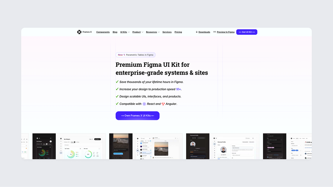
Frames X has a rich history, dating back to the time when Sketch was more popular than Figma. Back then, it was simply called Frames and became the world's second design system for Sketch in the world. In addition to Frames X, Dmitriy Bunin created many other high-quality products and UI kits for Figma. Now he is fully focused on developing Frames X for Figma.
Frames X doesn't aim to impress potential buyers with enormous size. Instead, it offers innovative approaches to component creation (for example, parametric variants) and serves as a reference point for those who want to professionally master the creation of design systems for Figma.
Frames X for Figma has been actively developing and regularly updating since 2021. It is one of the few products in this niche whose author hasn't abandoned it and continues to improve it to this day.
Frames X in numbers:
- 3500+ components and variants
- 700+ variables and styles
- 100+ templates
Basic features:
- Figma variables support: Yes
- Free version: No
- Dark theme: Yes
- Responsive design: Yes
Notable features:
- Free Design Handbook with useful design tips included
- Interactive components
Frames X is a powerful author-driven product with a professional approach to component creation and design system organization, which is equally well-suited for both beginners and experienced product designers.
3. Untitled UI - best all-in-one
untitledui.com - From $129 or free
“Design fast. Build consistently.”

Untitled UI is considered the largest UI kit for Figma, allowing you to create not only web applications, but also landing pages, and even email templates. Such volume is both an advantage and a disadvantage - it can make your component library bulky and unwieldy. Removing unnecessary components will also require significant time.
This design system was developed by Jordan Hughes, who has become an example for many beginning designers aspiring to create their own successful product.
Untitled UI in numbers:
- 9000+ components and variants
- 900+ variables and styles
- 400+ templates
Basic features:
- Figma variables support: Yes
- Free version: Yes
- Dark theme: Yes
- Responsive design: Yes
Notable features:
- Marketing components: pricing sections, blog sections and etc.
- Webflow version
Untitled UI is great because it provides a complete set of components "here and now," but it has a high entry threshold. Design beginners will find it difficult to understand Untitled UI, while experienced designers may face problems when customizing such a large component library.
4. Atomize UI kit - best for inspiration
atomizedesign.com - From $59 or free
“Atomize empowers designers to create modern and visually appealing user interfaces and websites, while eliminating tedious tasks”

Atomize UI is a design system and UI kit for Figma that can be described as made with love. The authors of Atomize UI took a creative approach not only to the library itself and the organization of components within the file, but also to the design of their website. We recommend checking out both the preview of their Figma file and the website.
The style of this design system stands out noticeably among others and doesn't look generic. This attracts many designers and is better suited for small and medium-scale projects where a more casual style is appropriate, but it's likely not suitable for Enterprise-level companies.
Atomize UI in numbers:
- 1400+ components and variants
- 340+ variables and styles
- Several templates
Basic features:
- Figma variables support: Yes
- Free version: Yes
- Dark theme: Yes
- Responsive design: No
Notable features:
- Web3 components
- Unique style
Atomize UI is a small but special UI kit that's worth exploring, if only because Akash Tyagi takes a meticulous approach to creating each component.
5. Sort UI - best UI polish
sortui.company - From $79
"Easily design and customize interfaces and applications using Figma’s powerful features and pre-built UI components - perfect for efficient, high-quality project launches”
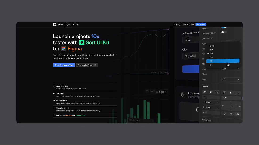
Sort UI is a UI kit and design system for SaaS, admin panels and dashboards created by a designer with the nickname Shiryoku. The main standout feature of Sort UI is its high-quality interface design with special, meticulous attention to details. Sort UI's design is clearly inspired by Notion, which has always been considered a benchmark for many interface designers.
Sort UI goes beyond designing just for SaaS in Figma. The product also offers a version for landing pages and a separate version for Framer.
Sort UI in numbers:
- 2300+ components and variants
- 400+ variables and styles
- Several templates
Basic features:
- Figma variables support: Yes
- Free version: No
- Dark theme: Yes
- Responsive design: Yes
Notable features:
- Multi-Theming Ability to switch between fully branded themes.
- Perfect for startups and freelancers
Sort UI for Figma is an excellent example of a quality approach to web application design. A great choice for startups and freelancers.
6. Koala UI - best for landing pages
koalaui.com - From $129 or free
“A Figma Design System and UI Kit made for Designers and Founders who want to test multiple ideas fast”
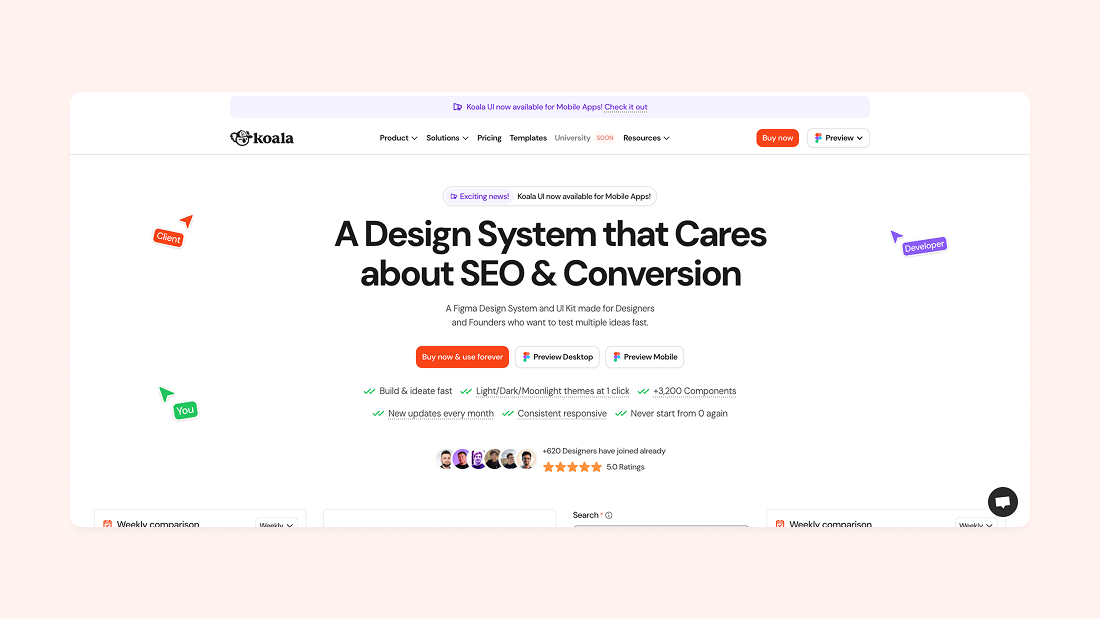
Koala UI is a relatively new design system and UI kit for Figma from Jordi Espinosa. Koala UI targets all user segments at once and develops components not only for SaaS, but primarily for marketing websites and landing pages. The main focus of Koala UI is on landing page design. Overall, it's a rather comprehensive design system for solving many tasks, but the product's focus is still a bit blurred. Koala UI also has versions for Framer and Webflow.
Koala UI in numbers:
- 3200+ components and variants
- 180+ variables and styles
- 200+ templates
Basic features:
- Figma variables support: Yes
- Free version: Yes
- Dark theme: Yes
- Responsive design: Yes
Notable features:
- New updates every month
- 3 Themes Available
Koala UI is a well-organized, comprehensive component library for Figma with great potential to become one of the most popular component libraries for Figma or Framer.
7. Align UI - best if you need code parity
alignui.com - From $119
“Flexible components, consistent UI, quick development, easy integration”
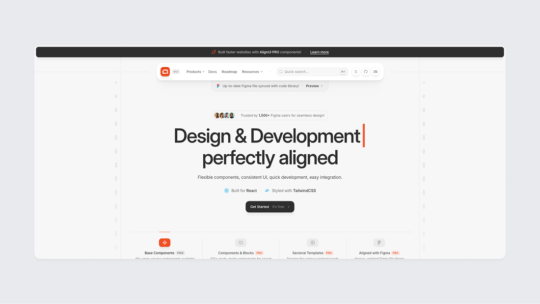
Align UI is a design system and UI kit for creating stunning dashboards and other interfaces with deep customization capabilities and developed by an entire team led by Erşad Başbağ. The distinctive feature of Align UI is the implementation of the entire design system in React code, which enables 100% synchronization between the design team and developers, however, the price for such a solution may not appeal to everyone. For the “Figma + Code” license, you'll have to pay $339 per user, which isn't very suitable for freelancers, startups, or small teams.
Align UI in numbers:
- 7800+ components and variants
- 280+ variables and styles
- 100+ templates
Basic features:
- Figma variables support: Yes
- Free version: No
- Dark theme: Yes
- Responsive design: No
Notable features:
- Implemented in code
- 80+ unique widget components
Align UI is a good choice for large and enterprise-level teams who need Figma components implemented in code and can pay $399 per user.
8. Ant Design System - best for enterprise
antforfigma.com - From $109
“Design and develop UI projects faster than ever”
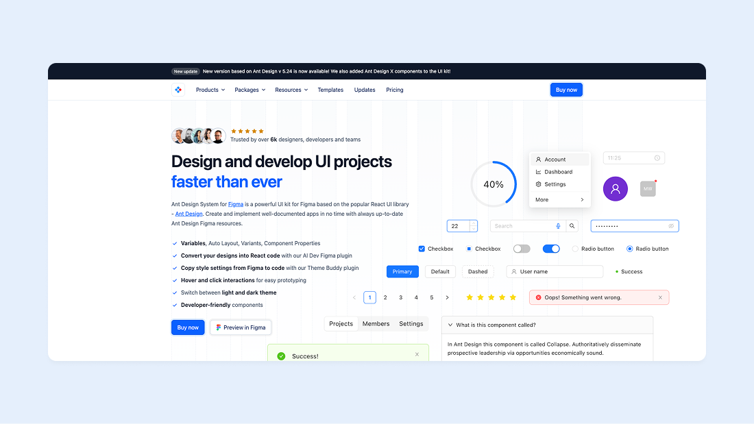
Ant Design System for Figma is a powerful UI kit for Figma by Matt Wierzbicki, based on the popular React UI library - Ant Design by Ant Group from China. The library is extensive and contains almost all necessary components for developing SaaS services and admin interfaces. It's one of the first "complete" design systems for Figma, whose popularity grew thanks to the open source React library that became the foundation of this UI kit.
Users consider outdated design and difficulty of customization to be the disadvantages of Ant Design System. The setup issues concern not only the Figma file, but also the React library itself.
Ant Design System in numbers:
- 4000+ components and variants
- 2000+ variables and styles
- No templates
Basic features:
- Figma variables support: Yes
- Free version: No
- Dark theme: Yes
- Responsive design: No
Notable features:
- Based on popular React library
- Huge number of components
- AI Dev Figma Plugin
Ant Design System is perfect for enterprise teams and other large businesses. However, it's worth noting that this library has a rather outdated component design.
9. Shadcn Kit for Figma - most popular React library in Figma
shadcndesign.com - From $119
“Extensive collection of Figma and React resources to help designers, developers, and teams deliver shadcn/ui projects efficiently.”
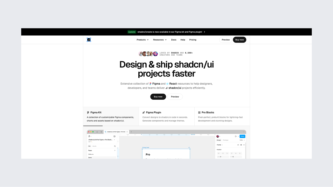
Shadcn Kit for Figma by Matt Wierzbicki is an unofficial but accurate implementation of the popular shadcn/ui library. Each component precisely replicates the original: Auto Layout, variants, theme variables, light and dark themes, charts. The main advantage is complete parity between design in Figma and code, which solves the fundamental problem when working with shadcn/ui.
Supports multi-branding and modern Figma features. Pricing starts at $119 for a personal license, with additional licenses available that include code and a Figma plugin.
Shadcn Kit in numbers:
- 7800+ components and variants
- 280+ variables and styles
- 100+ templates
Basic features:
- Figma variables support: Yes
- Free version: No
- Dark theme: No
- Responsive design: Yes
Notable features:
- Implemented in code
- Figma to shadcn/ui plugin
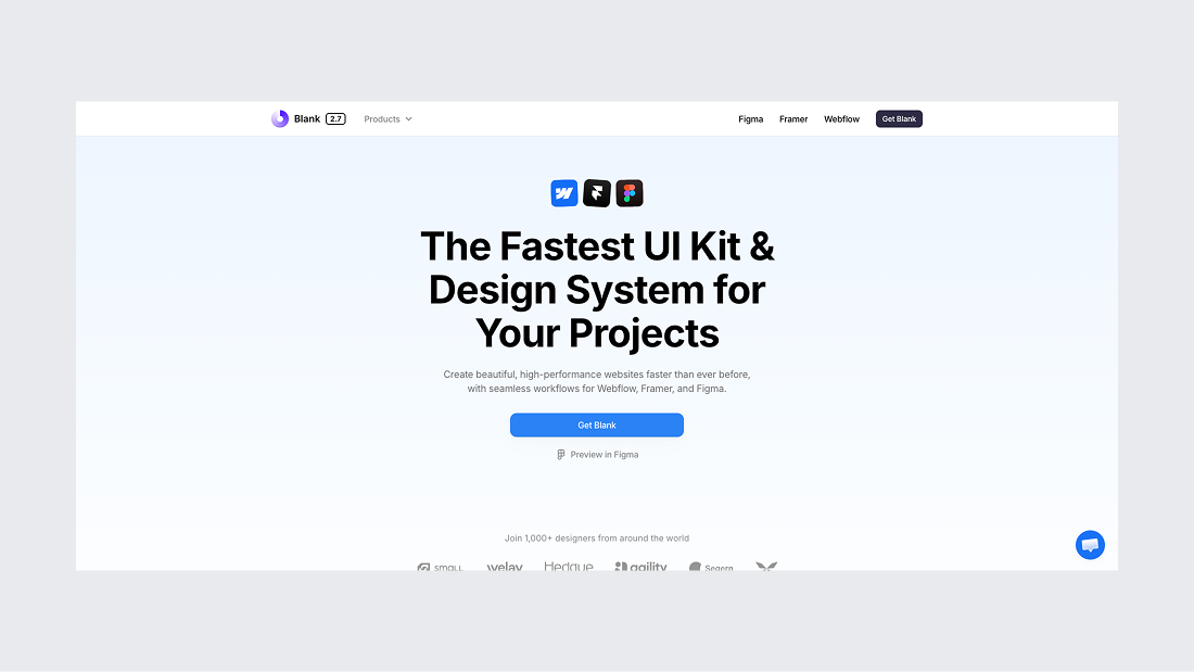
10. Blank UI kit for Figma - compact and well organized
useblank.design - From $89
“The Fastest UI Kit & Design System for Your Projects”
Blank Design System is a beautiful UI kit for web design from the Craftwork Design team. It includes 3200+ fully customizable components for creating high-quality landing pages. This is one of the more compact UI kits on the list, but very well organized: Auto Layout 5.0, variables, ready-made templates and layouts for inspiration
Blank Kit in numbers:
- 3200+ components and variants
- 300+ variables and styles
- 100+ templates
Basic features:
- Figma variables support: Yes
- Free version: No
- Dark theme: Yes
- Responsive design: Yes
Notable features:
- Webflow and Framer versions
11. iOS and iPadOS 26 kit - best for iOS
figma.com/community - Free Figma UI kit
“Apple’s iOS and iPadOS 26 UI kit for Figma helps you quickly and easily create highly accurate iPhone and iPad design comps and user flows.”
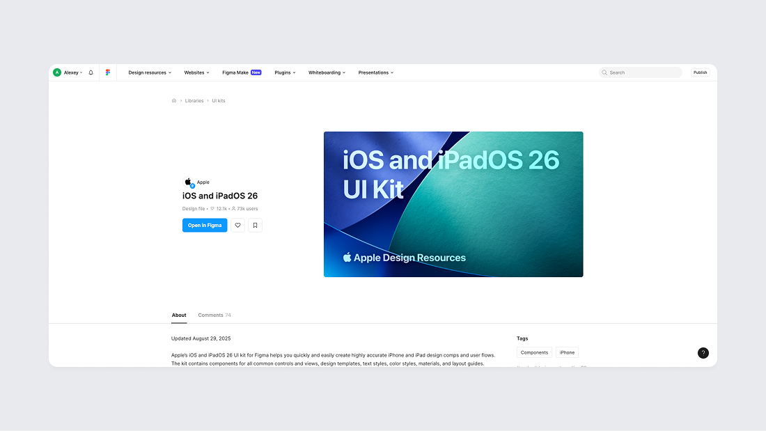
For the third year in a row, Apple delights the design community by releasing official iOS UI kits for Figma almost immediately after the WWDC announcement. As of 2025, Apple has released official UI kits for iOS 17, iOS 18, and iOS 26 with Liquid Glass effect support.
The main advantage of these UI kits is that they are official, i.e., they are created and maintained by Apple itself. You won't find a more modern component library for iOS on the market at the moment, if your requirements don't go beyond creating simple and native interfaces for iOS.
iOS and iPadOS 26 kit in numbers:
- 300+ components and variants
- 80+ variables and styles
- Several templates
Basic features:
- Figma variables support: Yes
- Free version: Yes
- Dark theme: Yes
- Responsive design: Yes
Notable features:
- Official support from Apple
- Support of Figma Liquid Glass effect
If you're planning to create a more or less native design for iOS, this library offers practically everything you need for quickly creating iOS interfaces.
12. Material 3 Design Kit - best for Android
figma.com/community - Free Figma UI kit
“Meet Material Design 3, Material Design’s most personal design system yet”
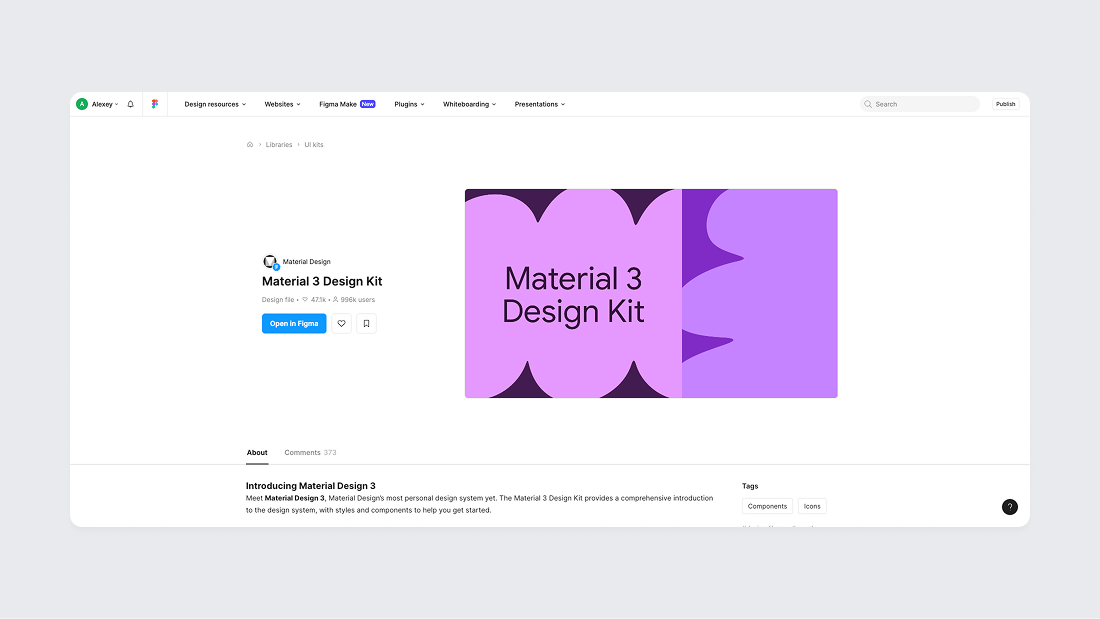
At Google I/O in May 2021, Google introduced "Material You" (also known as "Material Design 3"), a major evolution of their design system for Android 12. Since its introduction, Material Design 3 has been adopted across Google's product ecosystem and continues to evolve with additional components and refinements to better support cross-platform consistency. Material 3 Design Kit for Figma is the official and most complete implementation of this design system and UI kit, created and maintained by Google.
Material 3 Design Kit in numbers:
- 500+ components and variants
- 300+ variables and styles
- Several templates
Basic features:
- Figma variables support: Yes
- Free version: Yes
- Dark theme: Yes
- Responsive design: Yes
Notable features:
- Official support from Google
If you're planning to create designs for Android - choose this UI kit. It seems like there are no other good alternatives on the market
Conclusion
If you've read the article to the end, you can see that all UI kits and design systems for Figma are quite diverse, even though they may seem similar at first glance. Many new libraries appear monthly, but most of them stop updating immediately after release.
When choosing a UI kit and design system, focus on the specific product for which you're selecting a solution, and be sure to check how often the UI kit is updated. This is critical because Figma itself updates significantly every six months, and there's a risk of spending money on a design system that will either stop being supported or simply won't suit your needs.
I hope this article has helped you with your choice, and I wish you successful product launches!
