


So, what is a UI kit? A UI kit is a collection of ready-made interface components and styles that help designers create interfaces faster (sometimes x10–100 times faster) and more consistently.
A good UI kit should include everything — buttons, icons, typography, layouts, and more — so you don't have to make it all from scratch when you start designing a new project. By reusing these parts, product designers and front-end developers can speed up the design process and keep the look and feel consistent.
All modern design tools like Figma use UI kits as shared libraries of components that teams can use in their designs. Sometimes UI kits are called "design systems" and we'll cover that below. To begin with, we need to understand what a UI kit consists of…
What does a UI kit include?
A good UI kit usually has both design foundations and UI components:
Design foundations (colors, typography, and spacing)
An example from architecture will help you understand what design system foundations are. Imagine you're going to build an entire neighborhood with completely different houses – both residential and office buildings. And to avoid having to reinvent what colors will be used or, say, the size of doors in them, the best approach would be to come up with unified standards to save your time as a designer and the builders' time so they can construct the neighborhood faster. Another advantage of a standardized approach is that your neighborhood will look like a unified whole with the necessary level of variation.
You can come up with the same set of standards, but for building UI components like buttons or input fields. In UI kits, components are built on common colors, spacing, and typography (font styles)
Usually when creating UI kits, designers choose several color scales: for the primary color, warnings, shades of gray, and so on. Then they define one or two fonts in several sizes and a sizing grid for spacing and the sizes of the components. It's the foundation of any UI kit.
UI components (buttons, inputs, navigation, etc.)
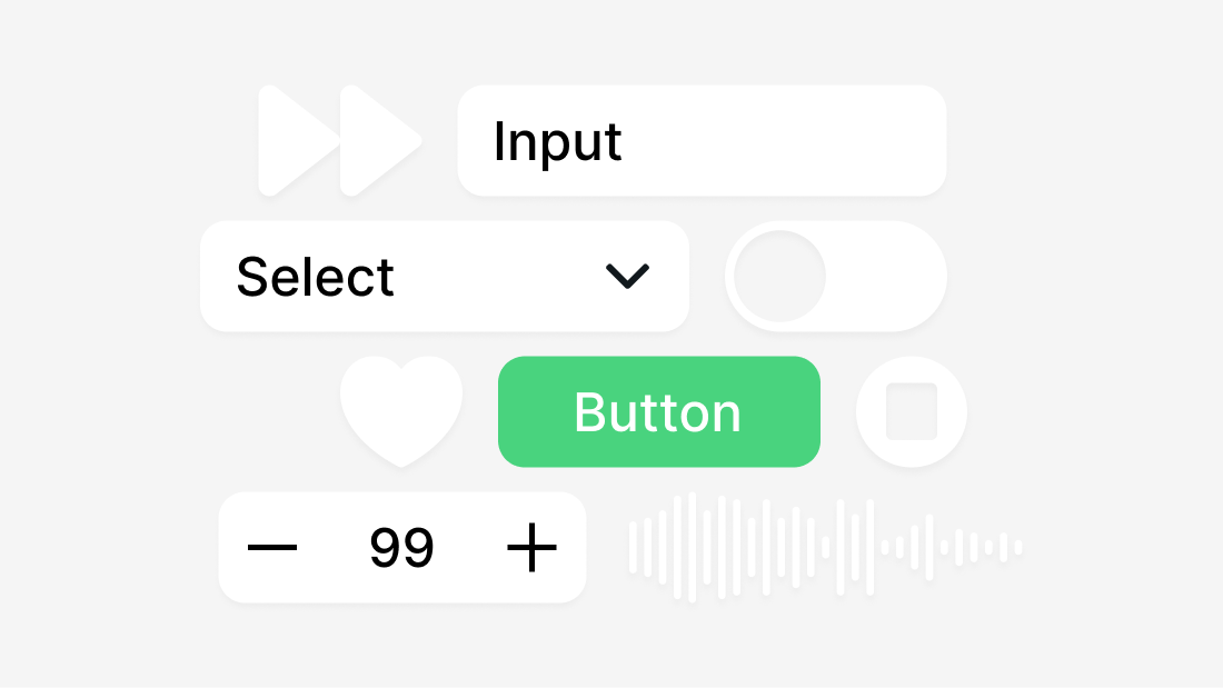
The main part of a UI kit is its library of reusable UI components. These are the interactive elements and patterns (large components with their own specific behavior) that are used to make user interfaces. Some common components are:
- Buttons (primary buttons, secondary buttons, and icon buttons in different sizes and states)
- Forms (input fields, radio buttons, switches, dropdowns, and checkboxes)
- Navigation (headers, menus, side navigation bars, tabs, breadcrumbs, and footers)
- Feedback components (modals, tooltips, alerts, notifications, progress bars, badges)
- Complex components (panels or card layouts that group content)
More complete UI kits may also come with pre-made layouts or templates for common pages, like a dashboard or login screen, that show how different parts can work together.
Most of the time, each part of a good UI kit is made with all the different variants and states it needs. For example, a button component will have different sizes or styles (filled vs. outline) and defined states for when the button is hovered over, active, or disabled. High-quality kits use features in tools like Figma (like Auto Layout and variants) to make sure that parts are flexible and easy to change.
In short, a UI kit has everything you need, from simple parts to complicated composite parts, all in the same design style.
UI Kit Examples and Types
UI kit types vary significantly — so much so that one UI kit cannot be used for different purposes. Unlike the architecture analogy we used earlier (where a residential space can be repurposed as an office), this doesn't apply to UI kits. Each type of UI kit serves exactly one purpose. Here are common types of UI kits:
Web Apps UI Kits (Dashboard and Admin UI Kits)
Web apps UI kits are for admin panels, SaaS apps, etc. These UI kits need more components because they're made for building complex web apps that show a lot of information on the screen. These UI kits typically include components like input fields, data tables, charts, and other specialized elements for complex interfaces.
The best and largest Figma UI kit for web apps and SaaS is Glow UI, which includes over 6,500 components and variants, multiple page templates, and supports both light and dark themes. It's designed specifically for building complex dashboards, admin panels, and enterprise applications with consistent, professional design.
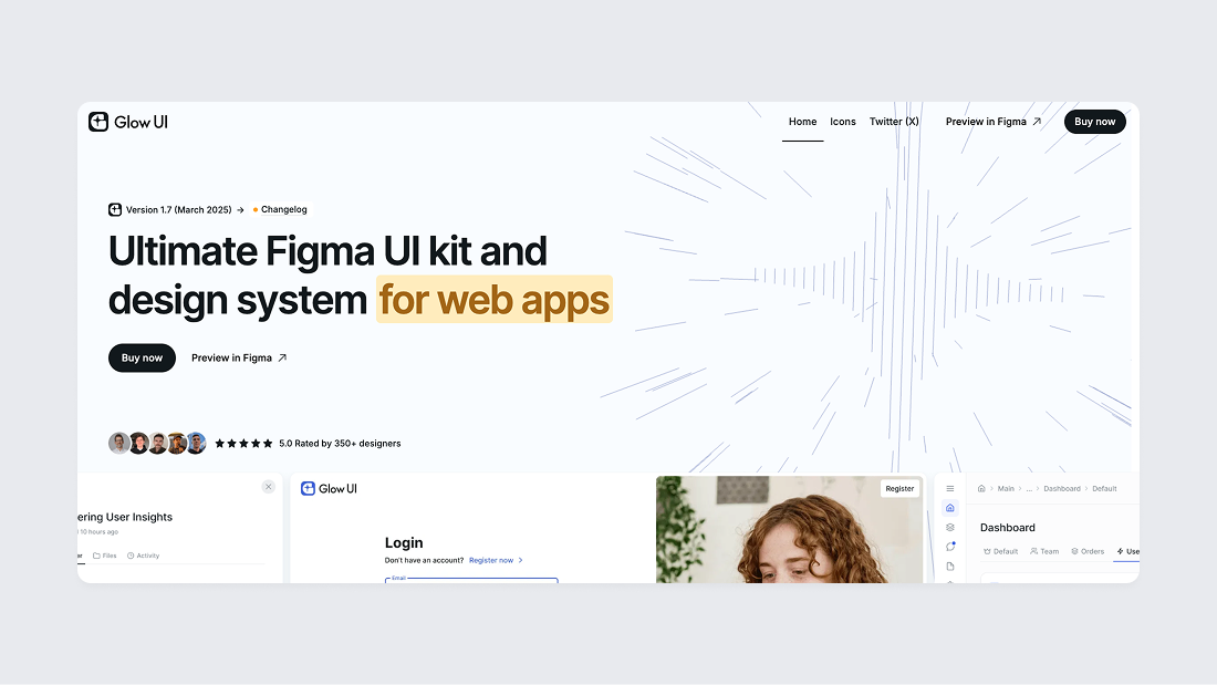
Glow UI is a UI kit and design system with support for the latest Figma Auto Layout 5.0 feature, a user-friendly component structure, and the best color system on the market (preview in Figma). Glow UI used by thousands of paid and free users. The UI kit is regularly updated, including all the latest Figma features introduced at Config 2023, Framework 2024, Config 2024, and Config 2025. It has everything you need to create modern interfaces.
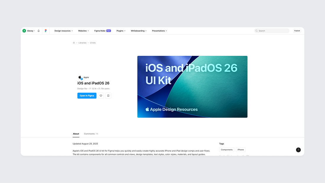
Mobile UI Kits
Mobile UI kits are designed for iOS, Android, or both platforms. They include platform-specific components like iOS navigation bars and Material Design elements. Apple's iOS UI kit and Google's Material Design kit offer standard mobile components that follow each platform's conventions, and they're both free to download from Figma Community.
Landing Page UI Kits
Landing Page UI kits are designed specifically for marketing websites and product landing pages. They include hero sections, feature showcases, testimonials, pricing tables, and call-to-action elements. These kits help marketers and designers quickly build attractive, conversion-focused landing pages without starting from scratch.
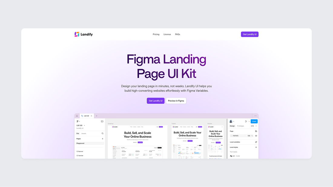
The most popular Figma UI kit for landing page design is Landify by Aravind Solaiappan, which offers a comprehensive collection of modern landing page sections, hero blocks, and marketing components optimized for conversion-focused designs.
Wireframe UI Kits
Wireframe UI kits provide low-fidelity components for quick prototyping. They use simple shapes and placeholder boxes instead of finished designs, helping designers plan out screens before adding final details.
There are also high-fidelity prototypes for testing detailed scenarios with users or within the team. They are created to get a detailed prototype without being tied to the style and to discuss only the logic of the interface behavior.
UI Kit vs Design System: What is the Difference
A design system is a broader concept that usually includes a UI kit but extends beyond it. Yes, it's that simple. Generally, a UI kit is a collection of components and styles, whereas a design system includes the UI kit plus documentation, usage guidelines, and often coded components. Key differences include:
- Scope: A UI kit covers the visual design assets (components, colors, fonts). A design system covers all that and also the rules of use, brand guidelines, and possibly code libraries, even a tone of voice.
- Documentation: UI kits usually don't provide detailed instructions, but design systems do (how to use each component, coding rules, etc.) and serve as the "source of truth" for both designers and developers.
- Who uses it: UI kits are good for solo designers, students and those who are just starting to create a product. Design systems are for the whole product team – designers use the visual parts, and developers use the code and rules to build everything the same way.
- Long-term use: UI kits work well for quick design work, especially at the start or in small projects. But if you're building a product that will grow over time, a full design system is a better choice. Design systems are updated regularly and grow as your product grows. A UI kit on its own might miss some edge cases or fail to keep everything looking the same when many people are working together.
In summary, a UI kit is one part of a design system. You might start with a UI kit to get all your visuals in one place, and then develop it into a design system by adding documentation, standards, and code implementation. (For a deeper explanation, see our guide on what a design system is)
How to evaluate a UI kit
If you have a little expertise or limited resources, it's better to buy a ready-made UI kit, especially since the market now has a lot of ready-made paid and free UI kits. When choosing a UI kit (especially a paid or professional one), we recommend considering the following points to ensure it meets your needs:
- Component coverage: Check that the kit includes the range of components you need for your project, and that each component has all necessary variations and states. For example, ensure it provides all basic controls you’ll use and any specialized components required for your domain field. The more complete the kit’s component library is relative to your requirements, the less time you’ll spend making custom additions.
- Consistency and quality: Evaluate how consistently the kit is designed. All components should follow a coherent style (consistent spacing, color usage, typography). Also inspect how the components are built – well-made kits use proper constraints and styles so they are easy to adjust, whereas poorly built components might break when edited. If everything in the kit looks and works consistently, it will be easier to integrate into your project.
- Accessibility: Consider whether the UI kit’s design is user-friendly and accessible. Are the color contrasts sufficient for readability? Are font sizes reasonable for legibility? While you may not fully verify accessibility from a static design kit, a good kit should not have obvious issues like very low contrast text or impractically small buttons. Kits that follow known design guidelines (Material Design, Human Interface Guidelines by Apple, etc.) usually embed accessibility best practices by default.
- Scalability and maintenance: Think about how easy it is to customize and maintain the kit. A valuable UI kit will use global styles or variables, allowing you to tweak themes (e.g. change the primary color or font across all components easily). Also consider if the kit is kept up-to-date by its creators – do they release updates or improvements? For a long-term project, you’ll want a kit that can adapt (or that you can extend) as design needs evolve. If you are working in a team, the kit should be well-organized and clearly documented so everyone can use it consistently.
What are the disadvantages of using a UI kit?
- Everything looks the same: If you use too many pre-made components from the same UI kit, your product might look just like everyone else's.
- Missing components: UI kits might not have everything you need for your unique product. You may have to build some components yourself.
- Hard to match your brand: Changing a UI kit to fit your brand's style can take a lot of work, especially if the kit is messy or hard to customize.
- UI kits can slow you down later if you don't turn them into a design system. A UI kit without clear instructions can cause messy designs and extra work when your team and product grow.
FAQ
Are UI kits free?
Many UI kits are free, but not all. Free kits are available in design communities like Figma Community, and companies like Apple and Google provide official UI kits for free. These can be useful but may be limited in scope or polish, and free UI kits often become outdated and stop being updated when new Figma features are released.
Premium UI kits offer more comprehensive, refined libraries with consistent quality and ongoing updates. Premium kits (such as Glow UI) save significant design time for professionals and teams. If you're on a budget, start with free UI kits. If you need an advanced solution, a paid UI kit is worth the investment.
Is a UI kit the same as a component library?
Yes — developers often call UI kits "component libraries," especially in front-end development. Both terms describe the same thing: a collection of reusable interface elements. The choice of terminology depends on context.
Can a UI kit replace custom UI design?
In many cases, yes. UI kits can fully replace custom design for standard interfaces where speed and consistency matter more than uniqueness. Custom design is still needed for highly branded or unconventional interfaces.
