


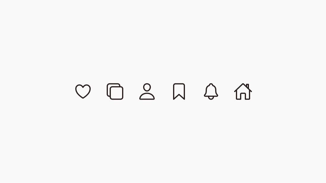
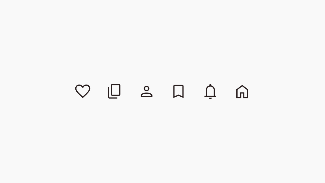
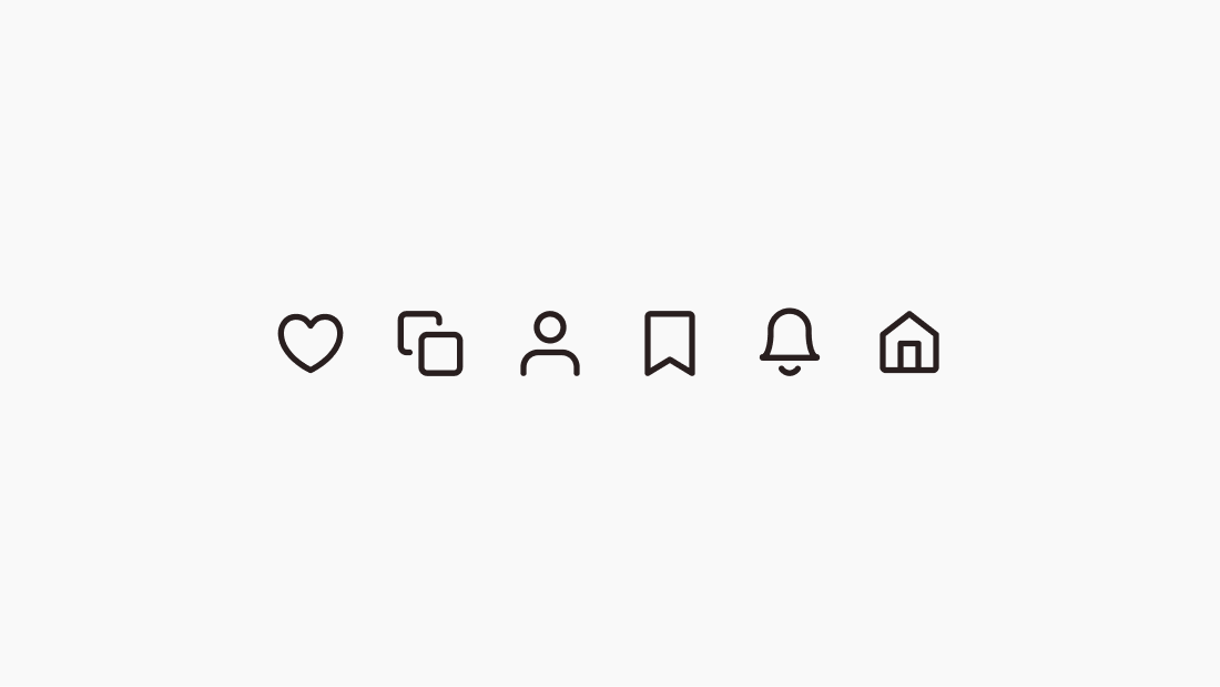
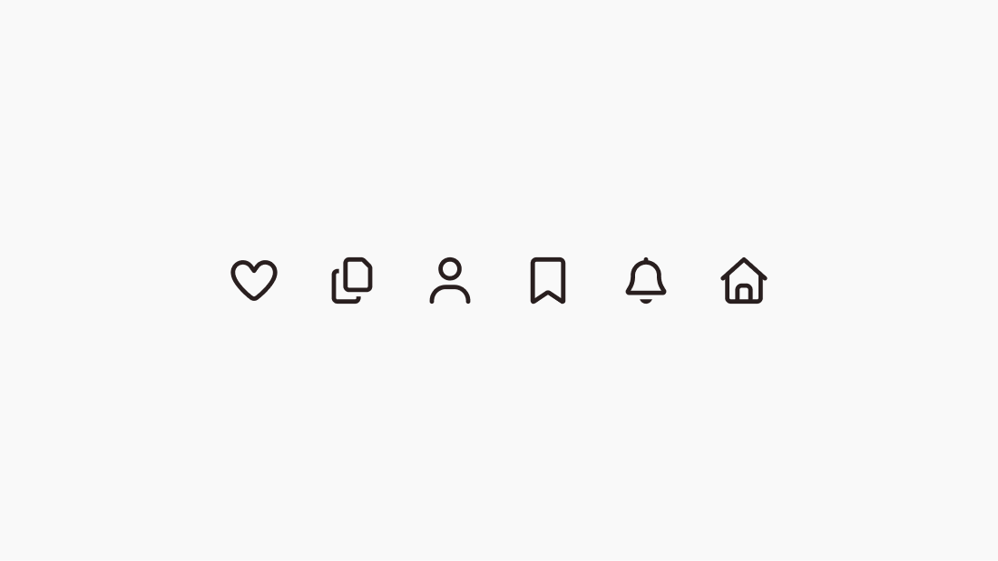
We see tens of thousands of icons every day — especially if we spend time on computers or phones. Modern app interfaces are impossible to imagine without icons. In a single day, we interact with numerous mobile and web applications (task trackers, operating systems, social networks), and we encounter dozens of different versions of just the close icon (the "X" symbol) alone.
Figma is the dominant interface design tool in 2026. According to the UX Tools annual survey, it holds over 80% market share among UI/UX designers, leaving Sketch, Adobe XD, and other competitors far behind. Every major tech company — from Google and Meta to Shopify and Stripe — uses Figma as a core part of their design workflow.
That's why we decided to focus specifically on icons for use in Figma.
Why icons are so important in UI design?
Icons have become invisible yet crucial elements of UI design. What makes them important?
- They bring clarity and draw attention to key actions
- They set the style of the application
- They convey meaning at first glance (when used wisely)
In every product and every team where I worked as an interface designer, the same questions always came up:
- Which icon library will we use?
- Will we have enough icons in this set so we don't have to draw many additional ones?
- Does the license allow us to use this icon set in our products?
The icon question became especially important when we started building the first version of Glow UI. We needed a license that allowed us to use the icons as part of a commercial product. We spent a lot of time just searching for ready-made icons. In the end, we created our own icons that fit our needs perfectly — they're called Glow Icons, and you can download and use them for free too. Now we know exactly how to answer the question: How to choose an Icon Set for UI/UX design? In this article, I'll answer these questions with up-to-date information for 2026.
How to choose an Icon Set for UI/UX design
There are different types of icons, and each serves its own purpose. There are app icons (like in iOS and Android), detailed icons for landing pages (more similar to illustrations), and many others. UI icons are practical tools, not works of art. Their main job is to be useful and easy to understand. So what makes a good UI icon? Let's break it down.
- Users don't like to think too much, so UI icons should be as simple as possible in meaning and form. This way the eye immediately catches them, they can be used at small sizes (for example, 16×16 pixels), and the icon's meaning remains clear.
- UI icons are never used in isolation — they are often placed next to each other. That's why it's important that they look uniform and consistent. This is achieved through a unified compositional grid for each icon.
- In UI design, it's important to guide the user's attention (for example, by using color on the most important button). That's why all icons should look equally important — this lets you control what stands out using color or other methods.
- In UI design, certain rules have been established over time. For example, we use a house icon to represent the home page, and an X to close. Therefore, an icon set for UI must follow established patterns, otherwise it will negatively impact UX. People who are used to standard icons might think something is broken if they see a completely different icon in a place where they expect a familiar one.
- If an icon set follows the rules outlined above, the next step is to evaluate the size of the set itself. The more icons in the set, the less often you'll have to draw new ones. For large projects, choose libraries with a large number of icons — general actions, navigation, special icons suitable for your field, and so on.
- For icon sets in UI design, it is critically important that all icons are in vector format (SVG), not raster (PNG, JPG). Vector icons do not lose quality when resized and look excellent on all modern monitors. PNG icons are a relic of the past, when graphics for websites and applications were only raster-based.
- Some icon sets offer both outline and filled (solid) versions of each icon, or even colorful duotone styles. This flexibility allows you to differentiate approaches to using one icon set in different styles (for example, using outline icons for secondary actions, filled for primary ones). Having matching filled and outline versions from the same family is a bonus. Glow Icons have exactly two matching styles
- Check how easy it is to integrate the icon set into your workflow. Most companies use Figma for designing layouts, so it's important that the icon set has a Figma version or plugin. Icon fonts (like Font Awesome) are convenient to use as text in code, but not always convenient in design. It all depends on your team's internal processes.
- Consider whether the icon set is free or paid, and its license. Open-source icons (for example, under the MIT license) are free even for commercial products, while others may require attribution or a paid license. Always review the license terms before use.
- Finally, the icon set should be regularly updated and expanded with new icons. This will give you confidence that the set will grow without your effort and account for current trends (for example, include icons for AI).
Using these criteria, we have compiled a selection of the best free and paid icons for UI design, relevant in 2026.
1. Remix Icons — a big pack with character
Simply Delightful Icon System
Website: remixicon.com
Figma plugin: Figma Community
Remix Icons provides 3,200 open-source icons in a neutral style — both outline and solid — by Remix Design Studio. They cover UI, weather, files, media, and much more. The universal design works for both web and mobile applications. The library is more extensive than Lucide Icons and Heroicons — it includes specific icons (file types, devices, etc.). Perfect for interfaces and dashboards. Free for commercial use and constantly updated. The only notable consideration is the angular style, which may not appeal to everyone. But some (like us) will find an appealing aesthetic in it
Quantity: 3200+ icons
License: Apache 2.0
Styles: Outline, Solid
SVG format: Yes
2. Tabler Icons — massive open-source collection with clean design
One Icon Set for Every Project
Website: tabler.io/icons
Figma file: Figma Community
Tabler Icons — a massive icon set from the creator of Tabler Admin Template for Bootstrap 5 — Paweł Kuna. The set includes 4985 icons in Outline and Solid styles under the MIT license. A key strength is the library's extensive size, ensuring comprehensive coverage for most design needs.
Quantity: 4985 icons
License: MIT
Styles: Outline, Solid
SVG format: Yes
3. Phosphor Icons — the biggest free icon pack for UI
Phosphor is a flexible icon family for interfaces, diagrams, presentations — whatever, really
Website: phosphoricons.com
Figma plugin: Figma Community
Phosphor Icons is a very large open-source icon family (MIT license) that includes thousands of glyphs. It contains over 9,000+ icons in three main styles: outline, solid, and duotone. The outline style is available in four weight variants: thin, light, regular, and bold. All icons are vector SVG, making Phosphor an ideal choice for designers who need a huge, consistent library.
Quantity: 9072 icons
License: MIT
Styles: Outline, Solid, Duotone
SVG format: Yes
4. Hero Icons — clean & simple SVG icons from Tailwind CSS creators
Beautiful hand-crafted SVG icons, by the makers of Tailwind CSS
Website: heroicons.com
Figma file: Figma Community
Heroicons is an icon set from the creators of Tailwind CSS that has gained enormous popularity among web developers and UI designers. It offers over 300 SVG icons in two styles (Outline and Solid). Heroicons are distributed under the MIT license (free) and were originally created to work with Tailwind UI components. By default, they have a friendly, slightly rounded look. Heroicons is an excellent choice if you're already using Tailwind or a similar design system. The only problem is that the icons seem to have stopped being updated.
Quantity: 316 icons
License: MIT
Styles: Outline, Solid
SVG format: Yes
5. Lucide Icons — community-driven fork of the legendary feather set
Beautiful & consistent icons made by the community
Website: lucide.dev
Figma plugin: Figma Community
Lucide Icons is a community-maintained fork of Feather Icons. The library has grown significantly compared to the original and now includes 1,668 icons, which has made it the default icon library for the most popular React component library at the moment (2026) — Shadcn. Unfortunately, this library inherited one drawback from the original — it only has an Outline style.
Quantity: 1668 icons
License: MIT
Styles: Outline
SVG format: Yes
6. Ming Cute Icons — good foundation and original categories
Carefully Designed Icon Library
Website: mingcute.com
Figma plugin: Figma Community
Ming Cute Icons is an extensive open-source library with over 3,000 SVG icons in two styles. The icons cover a wide range of categories — from basic UI elements to specialized ones: buildings, food, design, and even body parts. Ming Cute is distributed under the Apache 2.0 license and is completely free for commercial use. Some categories may seem excessive for smaller projects, but for teams that need maximum coverage or unusual icons, Ming Cute Icons is an excellent choice.
Quantity: 3000+ icons
License: Apache 2.0
Styles: Outline, Solid
SVG format: Yes
7. Flowbite Icons — perfect match for Tailwind CSS projects
Get started with a collection of 751 free and open-source SVG icons compatible with Flowbite and Tailwind CSS based on solid and outline styles with React (JSX) and Figma support.
Website: flowbite.com/icons
Figma file: Figma Community
Flowbite Icons is a free open-source library containing 751 SVG icons. It's designed for seamless integration with Flowbite and Tailwind CSS — popular frameworks for building modern web interfaces, but you can use these icons in your projects as well. The icons are available in two styles: outline and solid. If you're already working with Tailwind CSS or Flowbite, this library will be a natural choice thanks to its unified design language and ease of integration.
Quantity: 751 icons
License: MIT
Styles: Outline, Solid
SVG format: Yes
8. Iconoir — used by HBO and integrated in Framer
Say hello to your new free icon library
Website: iconoir.com
Figma file: Figma Community
Iconoir is one of the largest SVG icon libraries in the world by product designer and former Android Lead Designer Luca Burgio. To use this set, you don't need to register or enter your email — just grab it and use it in any ecosystem. Iconoir is available in Figma, React, and is even natively integrated into Framer. Interesting fact: Iconoir was used in the HBO series "Westworld" (season 4).
Quantity: 1500+ icons
License: MIT
Styles: Outline
SVG format: Yes
9. Ionicons — minimalist open-source icons
Open source icons. Lovingly hand-crafted.
Website: ionic.io/ionicons
Figma plugin: Figma Community
Ionicons — a minimalist icon set from the creators of Ionic Framework, designed for mobile applications. However, these icons work great for web applications too. The set is available in three styles: Outline, Filled (Solid), and Sharp, and also includes social media icons — this allows you to stay within a single set and not search separately for Facebook, Google, and other logos. Distributed free under the MIT license.
Quantity: 700+ icons
License: MIT
Styles: Outline, Solid, Sharp
SVG format: Yes
10. Material Icons — free icon library from Google with Material Design style
Icons from Google
Website: fonts.google.com/icons
Figma plugin: Figma Community
Material Design Icons — the official icon set from Google, following Material Design principles. The library contains more than 2000 icons in 18 categories: navigation, media, maps, and others. Outline and solid styles are available. The icons integrate easily into Material Design applications (Android and web), but are also suitable for other platforms and projects. The library is extensive and well-organized, and the official Figma plugin speeds up workflow. Excellent customization deserves special mention — you can adjust Optical Size, Weight, and Grade simultaneously. One great feature worth mentioning — you can change the Optical Size, Weight, and Grade of the icons all at once.
Quantity: 2000+ icons
License: Apache 2.0
Styles: Outline, Solid
SVG format: Yes
11. Glow Icons — perfect starter pack for UI design
Icons made for interfaces
Website: glowui.com/icons
Figma file: Download from Lemon Squeezy
Glow Icons is an icon library created specifically for interface design and use in the Glow UI Kit for Figma. Its main feature, in addition to meeting all the criteria of good icon sets for UI design, is distribution under the MIT license, the most transparent and 100% free license. The set includes the most in-demand icons for UI design in the two most popular styles: outline and solid
Quantity: 442 icons
License: MIT
Styles: Outline, Solid
SVG format: Yes
Glow Icons is an perfect starter pack when you need to quickly and freely get results in the form of a ready-made high-quality icon library for UI design, and under the most transparent MIT license
12. Font Awesome (Free Version) — 14 years of consistent quality
The internet's favorite icon library & toolkit
Website: fontawesome.com
Figma file: Figma Community
Font Awesome is one of the most popular SVG icon libraries and icon font developed since 2012 by Dave Gandy. The free version includes thousands of icons in three styles (solid, regular, and brand) that cover all standard UI patterns. This is the oldest and most enduring icon library I know of (as of 2024, Font Awesome was used by 25.4% of sites that use third-party font scripts, placing Font Awesome in second place after Google Fonts)
Quantity: 2089 icons
License: CC BY 4.0
Styles: Outline, Solid
SVG format: Yes
The main downside is that Font Awesome's paid plans and license terms can be hard to understand
Best premium paid icon sets for UI design
If for some reason the best free UI design icon sets we've selected for you don't suit your needs, then consider best paid icon sets:
Hugeicons Pro — From $59, 46000+ icons (7 styles)
Iconic Icons — From $99 per year, 1328 icons (1 style)
Untitled Icons — From $59, 4600+ icons (4 styles)
Anron Icons — From $56, 5000+ icons (5 styles)
Iconly Icons — From $99, 10800+ icons (6 styles)
Nucleo Icons — From $89, 5200 icons (2 styles)
Streamline Icons — From $99, 175000 icons (30+ styles)
Myicons — From $135, 15000+ icons (1 style)
Majesticons — From $149, 1100+ icons (2 styles)
Magicoon — From $38, 5400+ icons (4 styles)
How to use icons in Figma
Most modern icon sets for UI design are created with Figma workflows in mind — like all icon sets listed above — and provide official plugins and libraries you can just import to your Figma file. Here are a few basic ways to use icons in Figma:
- Copy and paste SVG files from your computer directly onto the canvas
- Use ready-made component libraries from Figma Community
- Use Figma plugins for icons
- Use icons that are part of design systems and UI kits for Figma
All icon sets listed above can be used directly in Figma — either via SVG import, official plugins, or Figma Community libraries.
FAQ
Can I use SVG icons in Figma?
Yes, and this is the most correct approach. Figma supports importing SVG files — just drag and drop them onto the canvas. Using SVG is the best practice for working with icons in Figma. When you add icons in SVG format, you retain the ability to edit their shape, change colors, and scale them without losing quality.
Is a larger icon set always better?
Not always. Typically, only 10-20% of all icons are used in real projects, and the rest is dead weight. First and foremost, make sure the set fits your style and is regularly updated.
What's better, icon fonts or SVG icons?
We don't recommend anyone use icon fonts in interface design due to major difficulties in maintaining them both in design and in code, and recommend using only SVG. No one has described the problems with icon fonts better than Michael Irigoyen in his article Stop Using Icon Fonts
Outline vs Solid Icons — When to Use Each?
In short — outline icons attract less attention and "dissolve" into the interface, while solid icons draw more focus. Use outline icons on cluttered screens where you need "more air" — for navigation or secondary actions. When you need to create emphasis, for example for key actions, use solid icons. However, you can easily stick with icons in one style for the entire product. For the past 8-10 years, the trend has been to use only outline icons in UI design, so some sets don't even include a solid style.
MIT vs Apache vs CC BY — What’s the Difference?
All three licenses (MIT, Apache 2.0, and CC BY 4.0) allow free use in commercial projects, but there are differences. MIT is the simplest — use it however you want, just keep the copyright notice. Apache 2.0 additionally protects against patent claims and requires documenting changes if you modify the code. CC BY 4.0 (Creative Commons) requires attribution to the author and indicating if changes were made. For designers, MIT license is the most convenient option.
